Let’s be Islands Together | interpreting the artwork
At the outset of the project, I designed a rule system for how I would express people’s data in the artwork.
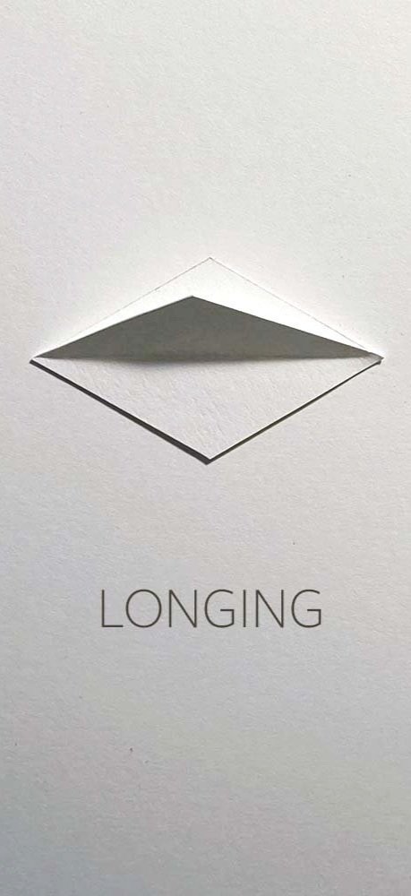
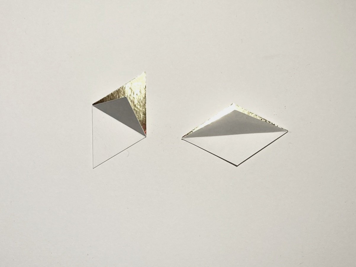
The spatial design of the board was led by the shape of the building blocks I created - interlocking diamonds that connect at a 60 degree angle.
I built the artwork on a 7 x 5 foot gallery board which I divided spatially into six sections. Functioning in a similar way to a scatterplot visualization, I created three sections describing how often a person feels lonely, and then divided this horizontally by degree of a person’s feeling of belonging in community.
how often a person feels lonely
feeling of belonging in community
Both the dimensional presentation of the shape and its orientation have meaning in the work…
dimensional presentation = TRUST IN COMMUNITY
orientation = BELONGING IN COMMUNITY
The volume and density of drawing on each tile indicates the intensity of a person’s loneliness…
less intense
more intense
A punched hole indicates a participant who experiences marginalization, chronic illness or injury, or is from a historically underrepresented racial or ethnic group…
Gold foil indicates a participant who feels that loneliness can be a positive experience…


