What’s Cookin? | visualizing job satisfaction
A series of data illustrations exploring how education level affects one's career, using meal preparation as a visual metaphor. Being new to Data Viz I was excited to learn more about this community of thinkers, researchers and designers, and to discover what makes them tick. With that in mind, I focused my analysis on attributes that would help me to get a better sense of who’s in DataViz, what their career pathways look like, and their joys and frustrations along the way.
Winner | 2021. Data Visualization Society SOTI
MOST BEAUTIFUL DESIGN


Being new to Data Viz I was excited to learn more about this community of thinkers, researchers and designers, and to discover what makes them tick. With this in mind, I focused my analysis on attributes that would help me to get a better sense of who’s in DV, what their career pathways look like, and their joys and frustrations along the way.
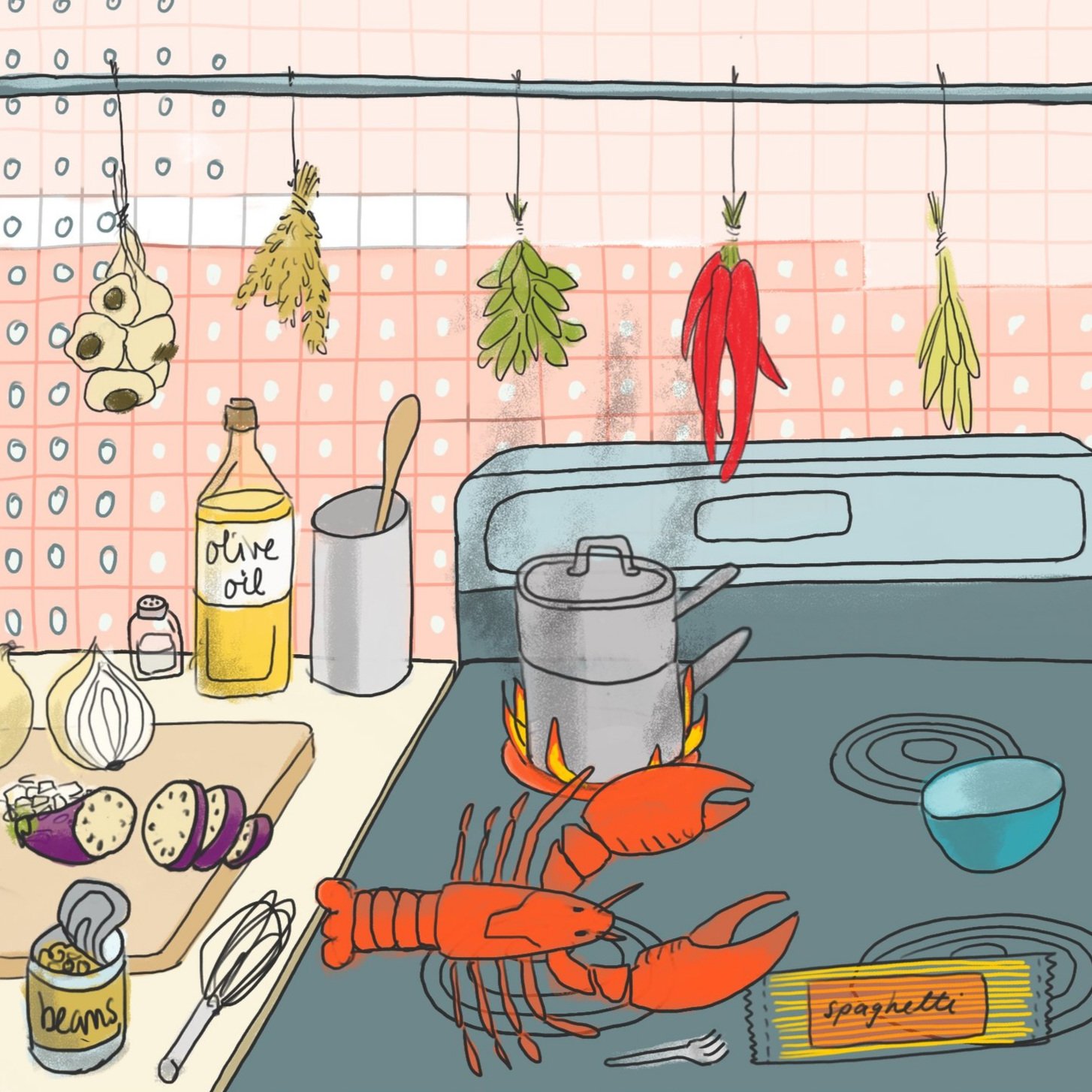
I was curious to learn how much schooling people in Data Visualization have, and how their education level affects their career satisfaction. I opted to amalgamate data within the container of Education with the aim of creating a series of impressions that might bring insight.
My visualizations are designed to be snapshots. I chose the metaphor of preparing a meal; exploring and analyzing data sets feels like choosing ingredients and assembling them into something delicious. One should be able to look at the illustration and get a sense of this person’s experience as it compares to that of others in the sequence. Everything you see in each illustration represents a piece of data (link to a pdf of my data analysis below each illustration). Use the legend to the right to interpret the artwork, or simply enjoy them as eye candy. Your choice!
High School / Some College

Technical College / Associate’s Degree

Bachelor’s Degree

Master’s Degree

Doctoral Degree